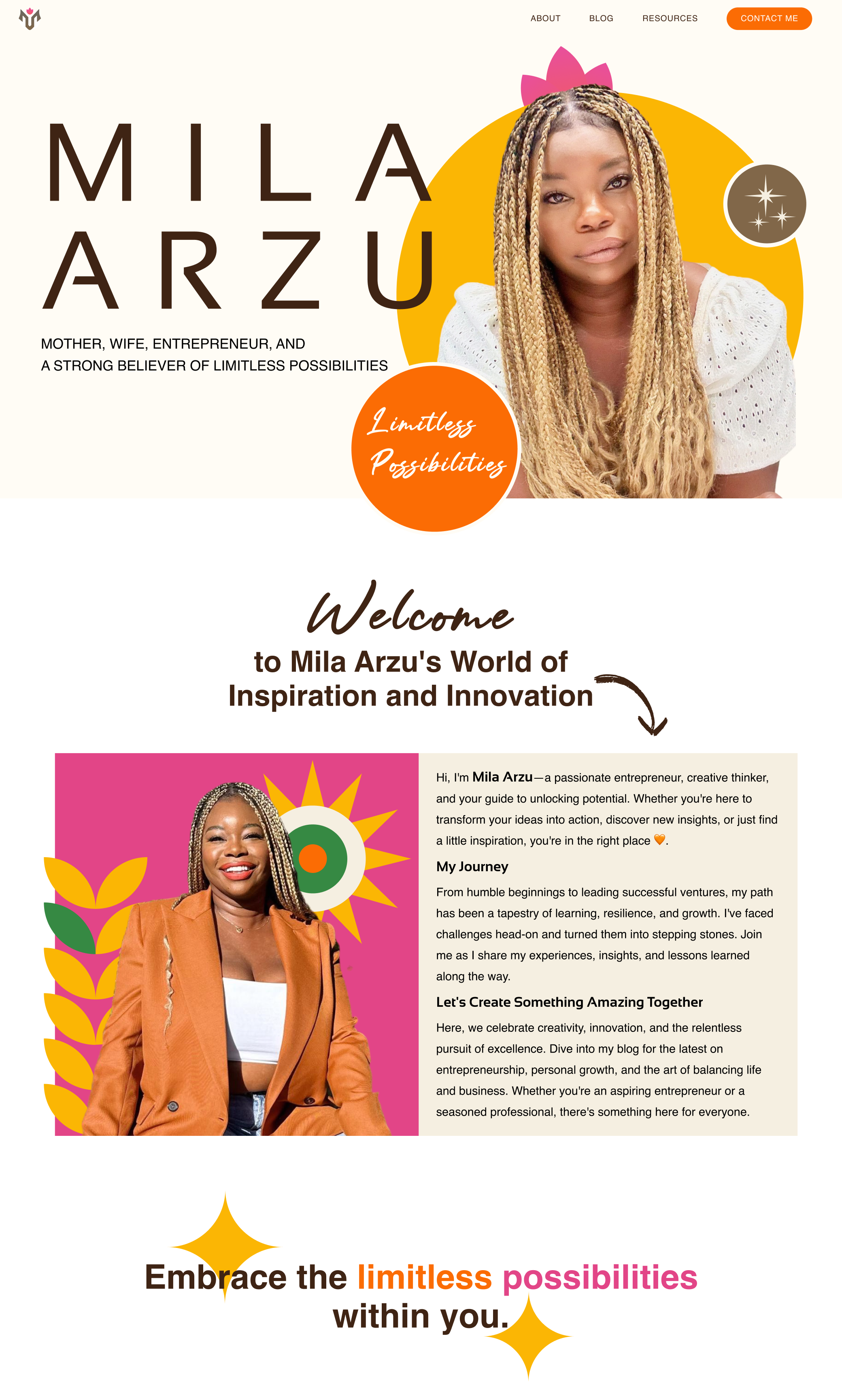
Mila Arzu
A personal brand for a Black Latina entrepreneur of Garifuna descent, built around resilience, cultural pride, and limitless possibility.
CLIENT
Mila Arzu
YEAR
2024
ROLE
Brand Designer & Art Director
SCOPE
Identity, web, planner, social
Brief
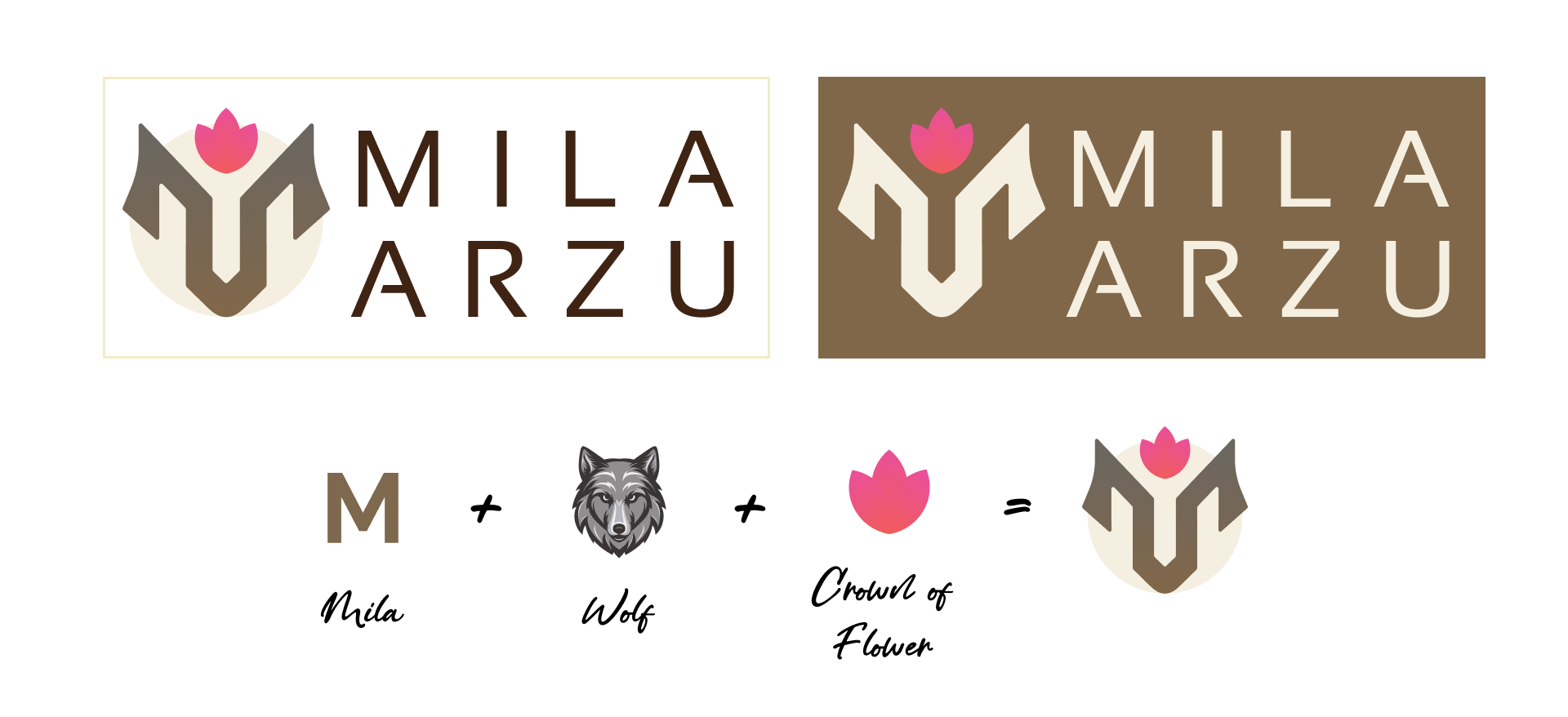
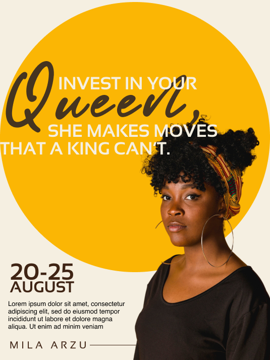
Mila Arzu needed a personal brand from the ground up, for a website, social, and a yearly planner she sells to her audience. She had two non-negotiables: a wolf in the mark, and a palette that felt bright and floral, echoing her Garifuna heritage. Wolves read serious. Florals read joyful. The brand had to hold both.
Approach
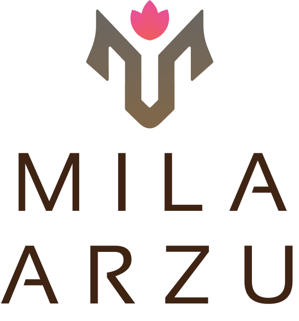
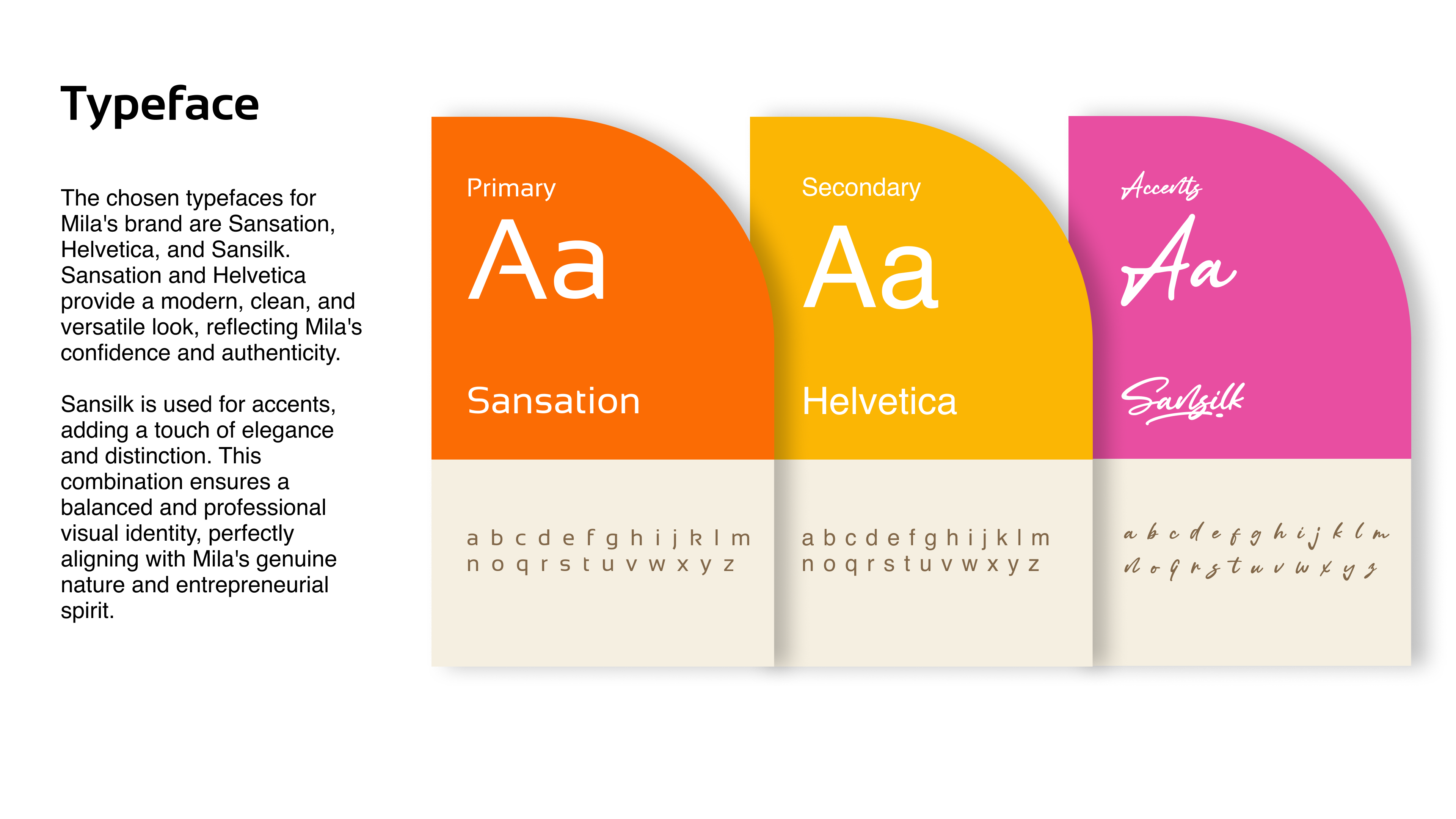
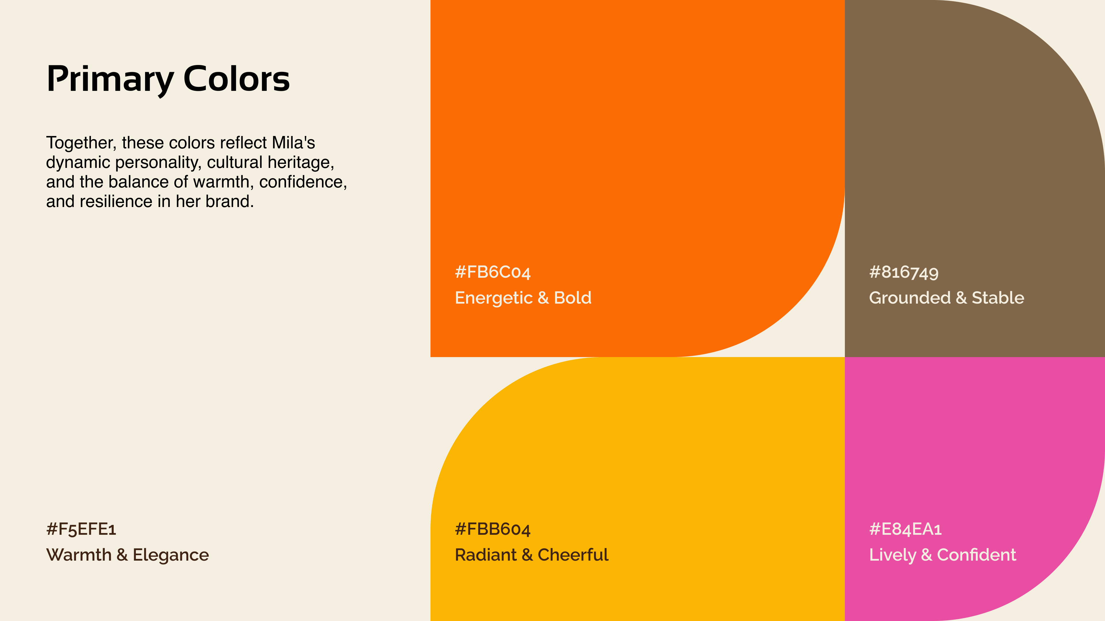
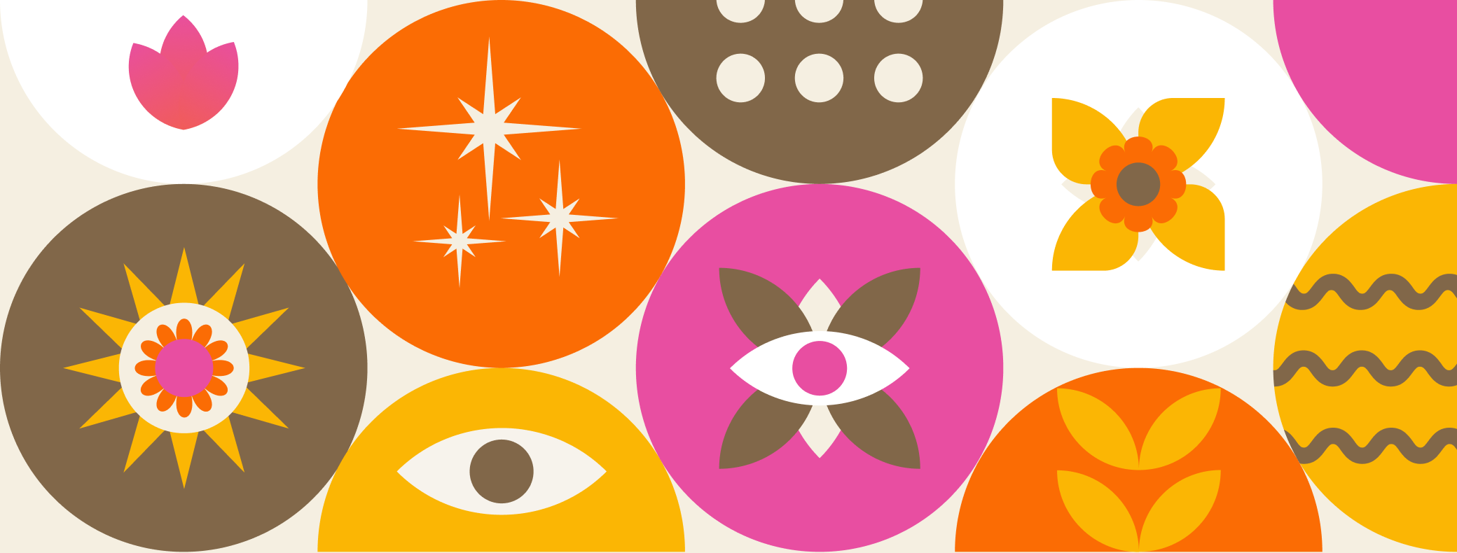
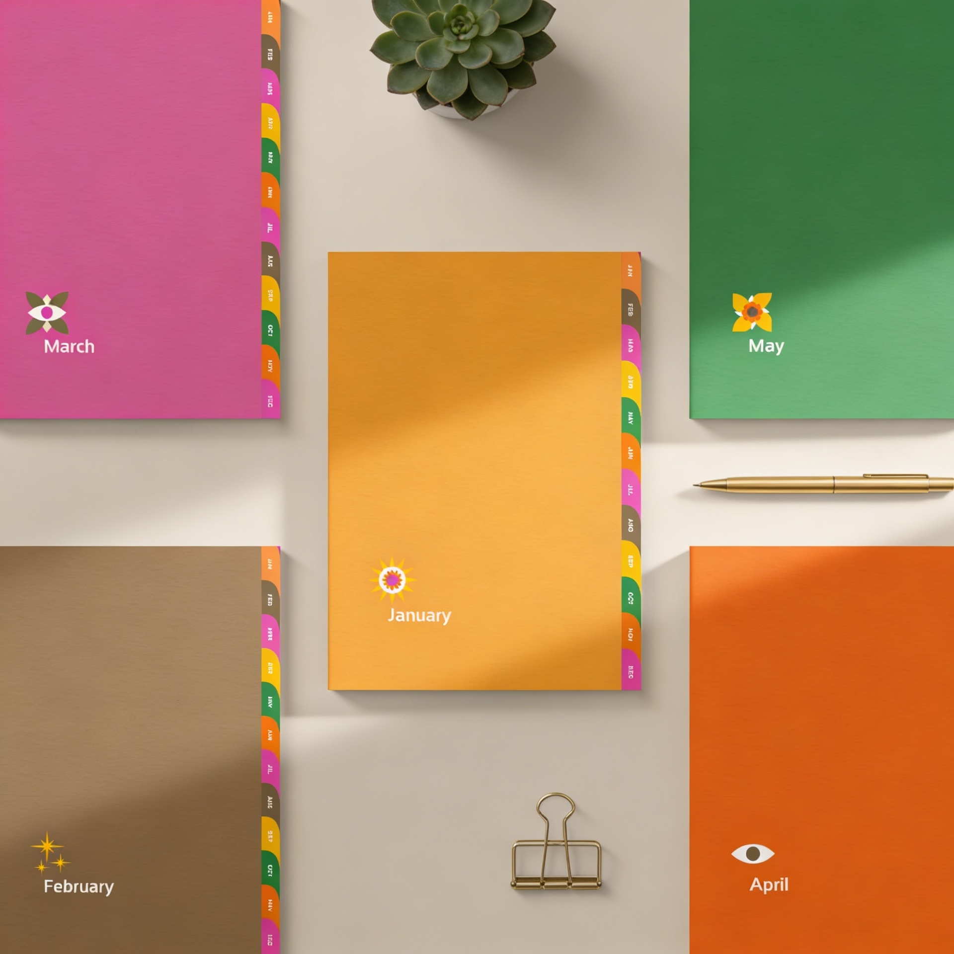
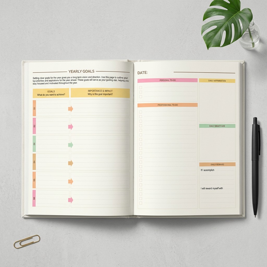
The logo became the place where the tension resolved, an "M" for Mila, a wolf for resilience, and a flower crowning the form for growth and culture. Geometric construction kept the mark confident; the floral crown kept it warm. The rest of the system extended outward: editorial type paired with approachable text, saturated oranges and pinks anchored by deep brown, and a vocabulary of geometric symbols that gave her social and print work a recognizable visual world without depending on the logo every time.
Website
Social Media
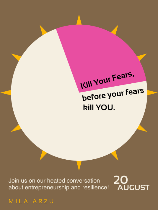
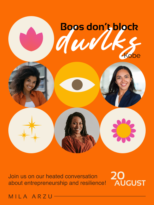
Print Products
Outcome
The most useful outcome wasn't the logo, it was a system Mila could run on her own. The icon library, color rules, and layout patterns let her produce on-brand content without coming back for every post. The real signal of fit came after launch: once the brand and website were live, Mila came back to commission the yearly planner — turning what started as an identity project into an ongoing brand system.