Foveo
A brand and digital refresh for Foveo, a funeral live-streaming platform serving funeral homes and the families they support.
CLIENT
Foveo
YEAR
2025
ROLE
Brand Designer & Art Director
SCOPE
Identity, web, marketing
Brief
Foveo had recognition in the funeral services industry but a brand that felt heavier and more ornate than the company it had grown into. They didn't want a disruptive rebrand, the essence had to stay. They wanted a simplified, more modern mark, ideally one that could live inside the Foveo wordmark rather than alongside it. The challenge was reduction without loss.
Approach
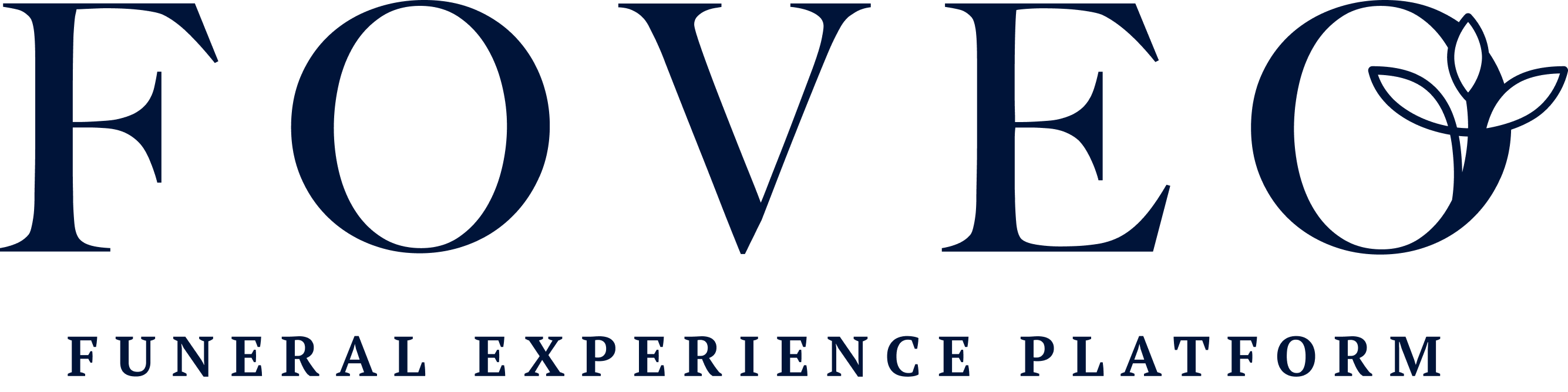
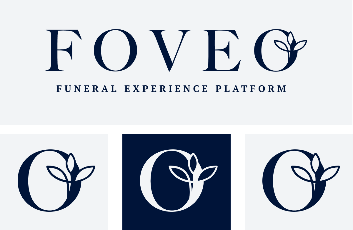
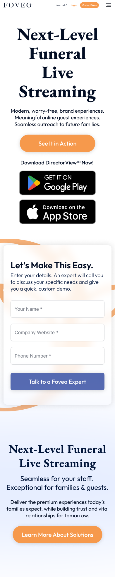
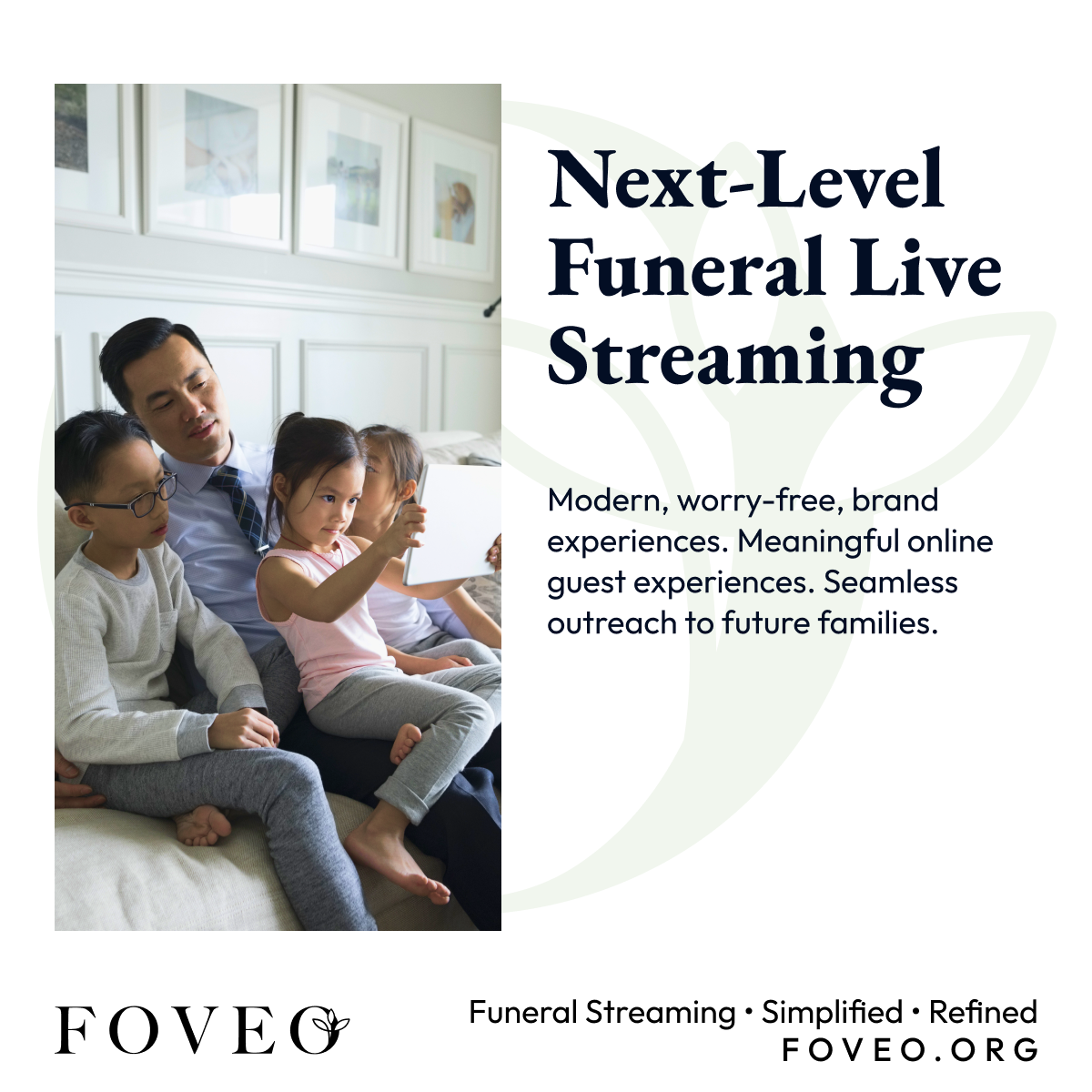
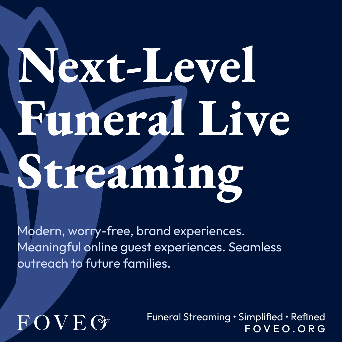
The design move was to absorb the floral mark into the final O of the wordmark. That single decision did most of the work, it removed the need for a separate emblem, gave the logo a quiet point of distinction, and held onto the floral motif customers already associated with the brand.
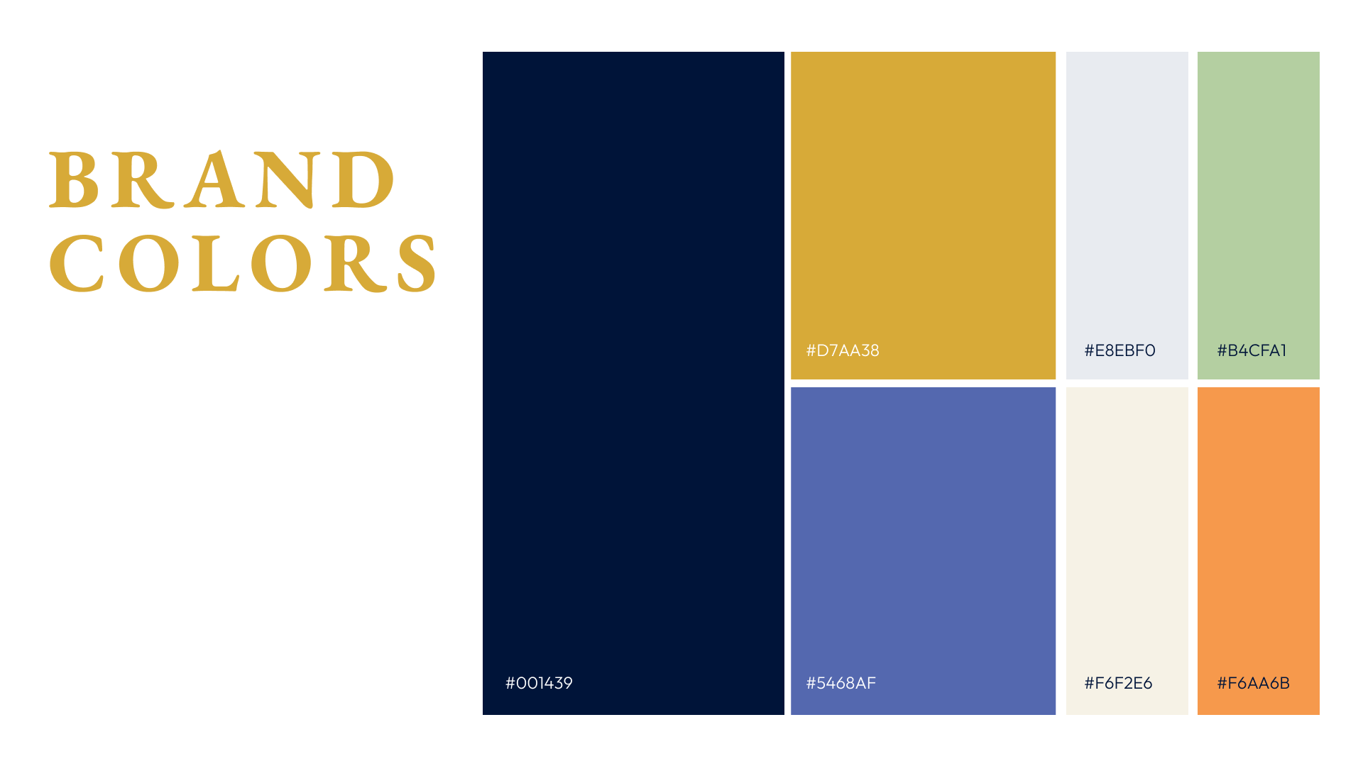
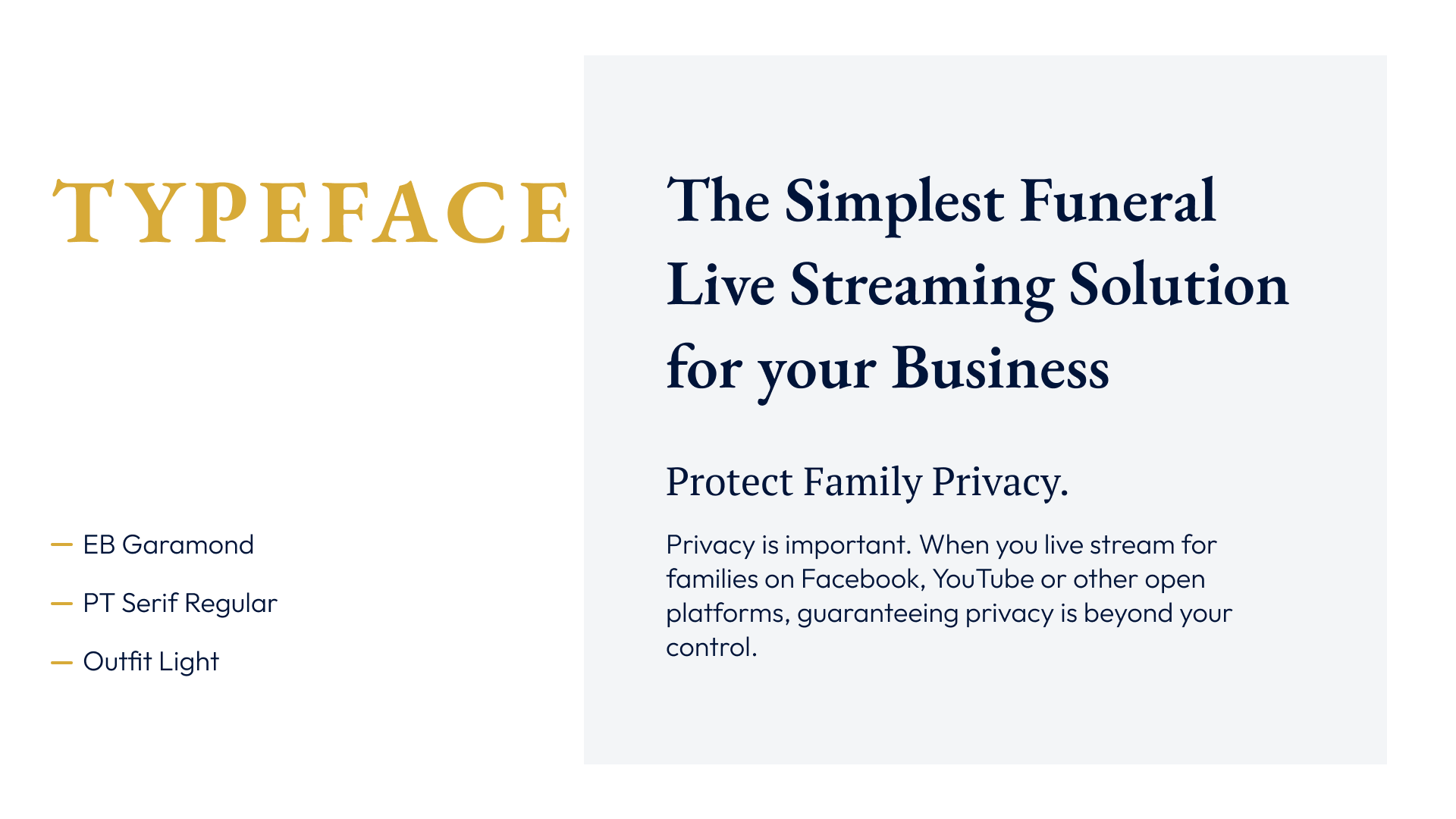
From there, the system was built to hold two audiences. Funeral homes are business buyers, they need a product that feels professional and easy to operate. Families using a stream are in grief. The brand cannot feel like software in those moments. The palette holds both: a deep navy for trust, a warm gold as the human note, softer accents for the family-facing side. Editorial serifs carry the gravity the industry expects; a clean sans carries the product clarity the operators need.
Branding

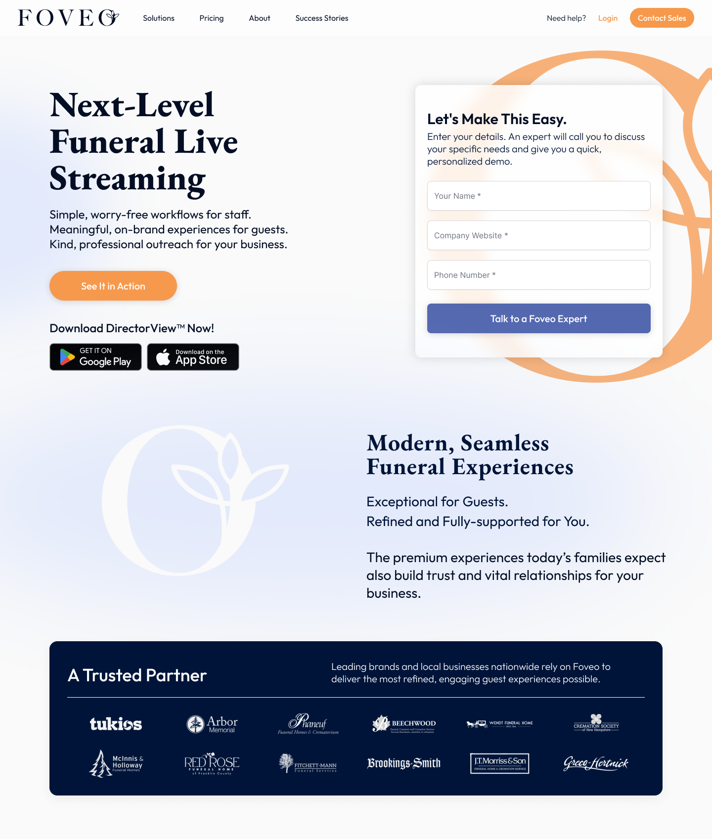
Website
Social Media

Outcome
The simplified mark gave Foveo a brand that could hold its two audiences without compromising for either. The wordmark works at favicon size and on the side of a building. The brand customers recognized, quieter, more current, easier to use across every surface the team needed it on.